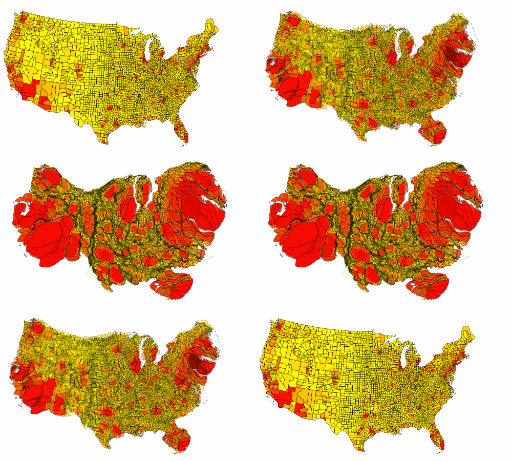
I read this post with an interesting animated gif looking at US residential property values within each county in the US. Note how most of the value is concentrated in California and the Northeast. From what I read, this is an example of a cartogram. Cool.
It starts with a standard map where yellow means relatively cheap residential area, while the more red, the higher the value.
This is the static picture (with labels):
1 year ago


No comments:
Post a Comment